
Brand Identity
League of Comic Geeks
Summary
01
Project Goals
Comic books are vibrant, expressive, and full of personality, so the brand guide will adopt a similar
approach, blending creative storytelling with practical guidelines.
02
Brand Identity
As a comic collecting platform, the goal is to honour the vibrant history of comics while making space for modern collectors, creators, and fans to connect, share, and grow.
03
Brand Elements
These brand elements are the foundational pieces that shape how we visually and emotionally connect with our audience.
04
Style
This section defines the overall tone, graphic approach, and visual language that should be used to ensure consistency across all branded materials—while leaving room for playful, creative expression.
05
Themes
The brand is brought to life through a series of fun, character-inspired themes that draw from the rich world of comic books. Each theme adds a unique personality to the platform, giving users the ability to choose an experience that resonates with their own fandom.
06
Wireframes & Mockups
This stage of the design process focused on translating ideas into structured, visual layouts. Initial low-fidelity wireframes were created to map out key user journeys and ensure a smooth, intuitive experience for comic collectors.
Project Goals
Comic books are vibrant, expressive, and full of personality, so the brand guide will adopt a similar
approach, blending creative storytelling with practical guidelines. This guide aims to:
01
Capture the essence of comic books
Using bold visuals, dynamic layouts, and engaging typography, the brand guide will feel like flipping through a comic book, immersing readers in the culture it represents.
02
Speak the Language of Comic Collectors
Every detail—from the colour palette to the tone of voice—will reflect the passion and nostalgia that collectors associate with their favourite comics.
03
Provide Practical
Structure
While playful and visually appealing, the guide will maintain clarity and organization, ensuring that all elements of the brand are easy to understand and implement.
04
Celebrate
inclusivity
Like the best comic stories, this guide will emphasize diversity and community, ensuring the brand remains welcoming to all fans, regardless of their background.
Brand Identity
The comic book world has always been about storytelling; about crafting vibrant universes filled with diverse characters, extraordinary adventures, and heroic journeys that inspire us all. At its core, this community thrives on creativity, collaboration, and connection.
As part of this rebranding of League of Comic Books, I am championing a vision where everyone feels represented, valued, and welcome. Inclusivity isn’t just an ideal—it’s a necessity for a thriving and evolving community.
It means recognizing the power of diverse voices, celebrating creators and fans from all walks of life, and ensuring stories resonate with the real-world experiences of our readers.
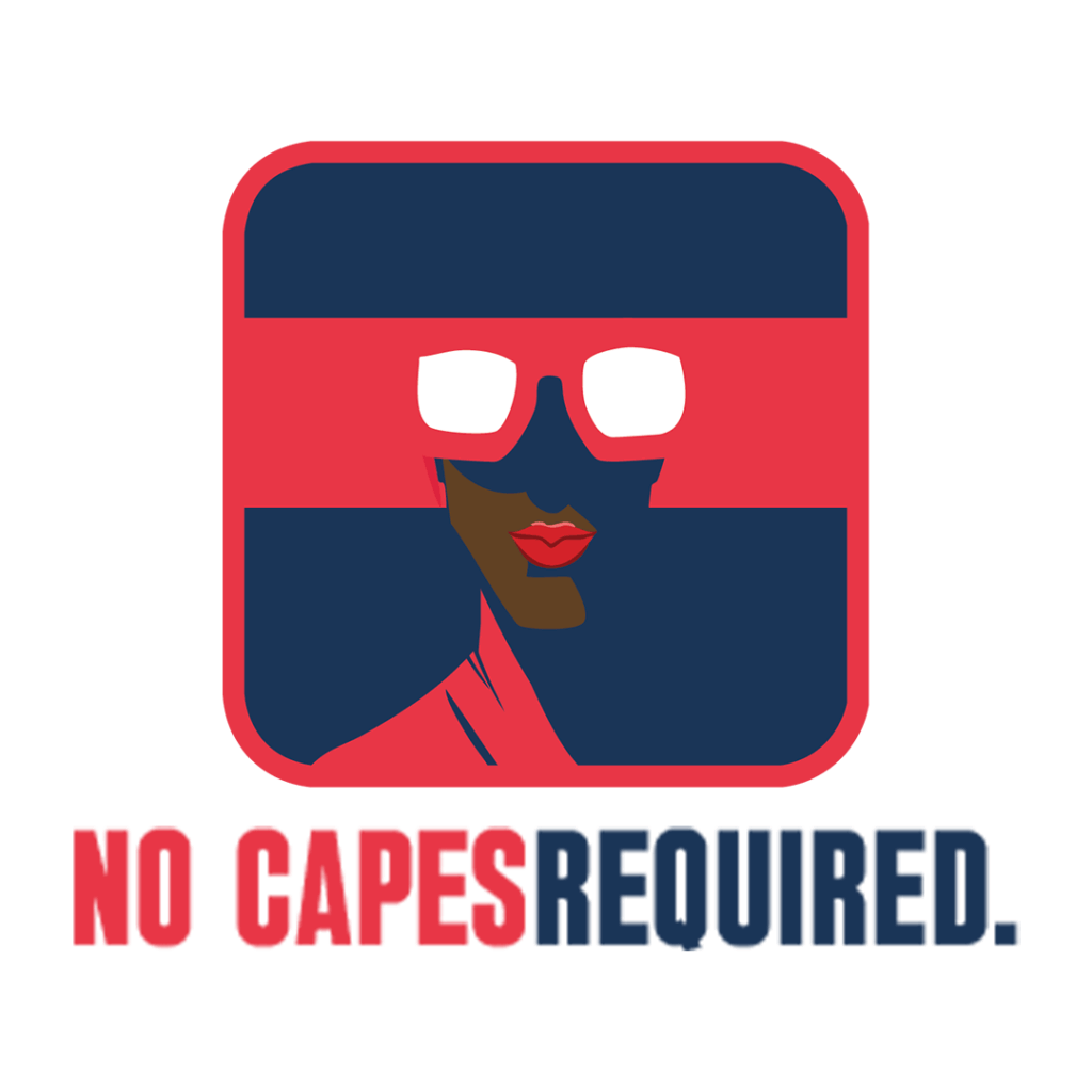
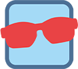
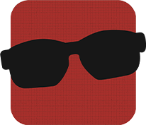
Main Logo

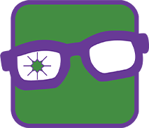
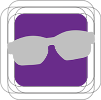
Icon #1
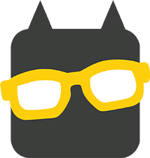
Icon #2
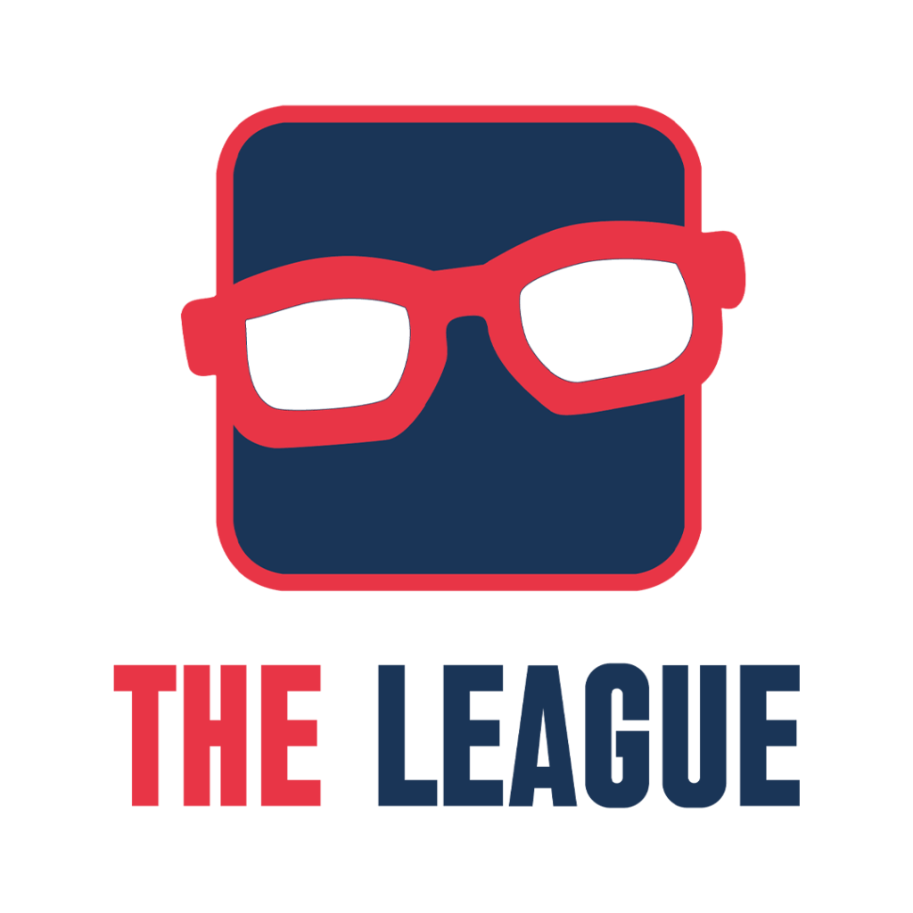
The logo for this project was carefully crafted in Adobe Illustrator, undergoing a series of refinements to better align with the brand’s mission and the vibrant energy of the comic book community. The goal was to design a logo that feels bold, inclusive, and representative of the creativity and passion shared by comic enthusiasts.

The evolution of the rebrand logo
Brand Elements
These brand elements are the foundational pieces that shape how we visually and emotionally connect with our audience.
Logo Colours
The colour red in comics often symbolizes energy, excitement and urgency, reflecting the passion and intensity of the comic book world while the colour blue reflects the trust and connection within the comic community.
The close proximity of the words “COMIC” and “GEEKS” in the logo visually represents the seamless connection between the two concepts and highlights the bond that unites comic enthusiasts.

Brand Iconography
In the world of comics, superheroes represent ideals: COURAGE, RESILIENCE, and HOPE. This figure isn’t confined by a specific gender, race or background. Instead it invites every fan and creator to see themselves within its silhouette.
An ambiguous icon challenges the traditional notions of what superheroes should be. This way, the icon becomes more than a representation of a single hero; it becomes a beacon of universality, inviting everyone to become a “COMIC GEEK” and reminding us that there is a hero in all of us.
Representation
The tilted glasses symbolize an important message:
You don’t have to be perfect to be a hero.
It is a reminder that even with quirks, flaws, or things that don’t make us fit in perfectly, we all have the potential to rise to heroic heights. It also helps that the glasses resemble masks akin to comic legends, the Teenage Mutant Ninja Turtles.
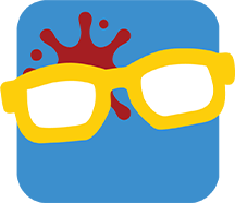
The vision for this rebrand is to create a vibrant and inclusive community where comic enthusiasts of all backgrounds can connect, celebrate diverse stories and share their passion. We aim to empower creativity, foster belonging, and prove that anyone can be a hero hence – NO CAPES REQUIRED.
Style
This section defines the overall tone, graphic approach, and visual language that should be used to ensure consistency across all branded materials—while leaving room for playful, creative expression.

Themes
The brand is brought to life through a series of fun, character-inspired themes that draw from the rich world of comic books. Each theme adds a unique personality to the platform, giving users the ability to choose an experience that resonates with their own fandom.
In the spirit of diversity and individuality, I am offering users the power to personalize your experience. Step beyond the primary brand colours and explore a range of unique themes inspired by iconic characters and styles. Each thme is a celebration of creativity and self-expression, letting you tailor.the site to reflect your own vibe.
RULES:
#1 Icons must remain unchanged in all aspects, including shape, colour, size, orientation, or any other modification to preserve brand consistency and integrity
#2 Icons must remain unchanged in all aspects, including shape, colour, size, orientation, or any other modification to preserve brand consistency and integrity
INCREDIBLE
Unleash the beast within as the mighty Incredible Hulk!
Whether it’s smashing barriers or being the symbol for resilience this theme is all about bold contrast and a smashing sense of identity.


THE CAPED CRUSADER
Step into the shadows with the Caped Crusader!
With a nod to justice, ingenuity, and the eternal battle against chaos, this theme captures the essence of Gothams’s silent guardian, the symbol of hope!


INVINCIBLE
Become a bold, unyielding force for justice!
This theme embodies the relentless pursuit of what’s right, even in the face of overwhelming odds. Stand as a testament to the power of determination and channel the spirit and courage of Mark Grayson-also known as…


HELLBOY
A symbol of power forged in the depths of darkness!
Hellboy is a demon raised a hero. Stand as the guardian against supernatural forces that threaten this world with your deadly Right-Click of Doom!


MAGNUS
Become a force to be reckoned with as the master of magnetism, Magneto!
Challenge the grey areas of morality and embrace your destiny – even if it’s misunderstood.


FREEZE
Embrace the power of resilience and the
depths of human emotion!
Under Mr. Freeze’s icy exterior and cold facade lies a story of love, loss an unwavering commitment – just
like the complexity you bring to every decision.


Wireframes & Mockups
This stage of the design process focused on translating ideas into structured, visual layouts. Initial low-fidelity wireframes were created to map out key user journeys and ensure a smooth, intuitive experience for comic collectors.
Wireframes

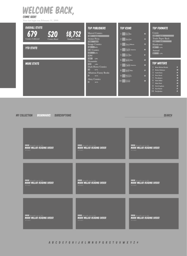


Mockups


