Brand Identity
Opal Records
Summary
01
Project Overview
This project explores a conceptual brand identity for Opal Records, a fictional music recording studio. The visuals include album artwork, social media mockups, and a custom media player interface.
02
Concept Development
The design concept for Opal Records draws heavily from hip hop and Black culture, taking cues from iconic labels like Shady Records and Top Dawg Entertainment. The goal was to reflect the vibrancy, resilience, and creativity rooted in these communities.
03
Key Visuals
This section showcases the completed visual assets created for Opal Records, including album artwork, social media mockups, and a custom media player design that reflect the brand’s bold, culturally rooted identity.
Project Overview
This project explores a conceptual brand identity for Opal Records, a fictional music recording studio. The visuals include album artwork, social media mockups, and a custom media player interface.
01
Develop Core Concepts
Create a cohesive visual language for Opal Records that reflects the spirit of hip hop culture and the professionalism of a rising music label.
02
establish a distinct brand identity
Our collaboration with renowned photographers and versatile videographers immortalize your precious memories.
03
Key Visuals Exploration
This section showcases the finished visual elements developed for Opal Records, including logos, album and deluxe artwork, a social media mockup, and branded media player.
Concept Development
The design concept for Opal Records draws heavily from hip hop and Black culture, taking cues from iconic labels like G-Unit and Top Dawg Entertainment. The goal was to reflect the vibrancy, resilience, and creativity rooted in these communities.
OPAL RECORDS
A Hip-Hop & RnB Recording Label
The name Opal Records was inspired by the way an opal gemstone, when held up to the light, reveals a spectrum of vibrant colours. This reflects the label’s core mission: to uplift and amplify the diverse voices of artists of colour. Like the gemstone, the label aspires to shine light on unique talent and provide a powerful platform for creative expression.
KINFOLK
Musical Protégé
Kinfolk is a conceptual artist developed specifically for this project, embodying the kind of talent and message Opal Records strives to represent. The name Kinfolk was chosen to evoke a sense of unity, shared culture, and deep-rooted connection. It symbolizes inclusivity—not limited by race or background—but grounded in the belief that music can create family. Anyone who resonates with that ethos is considered kin.
TARGET AUDIENCE
Focus Area
The core audience includes established artists, primarily from urban and culturally diverse backgrounds who are looking for raw storytelling found in Black and urban music communities.
LOGOS
OPAL Records
- Incorporating a record within the negative space of the “OR” in the logo.
KINFOLK
- Four hands coming together from each direction (North, East, West, South) symbolizing unity.
INFLUENCE
Record label inspiration
G-Unit, Top Dawg Entertainment, G.O.O.D Music, Dreamville
Artist Inspiration
Outkast, Kendrick Lamar, 2 Chainz, Lauryn Hill, Jeezy
VISION & INTENT
Goals
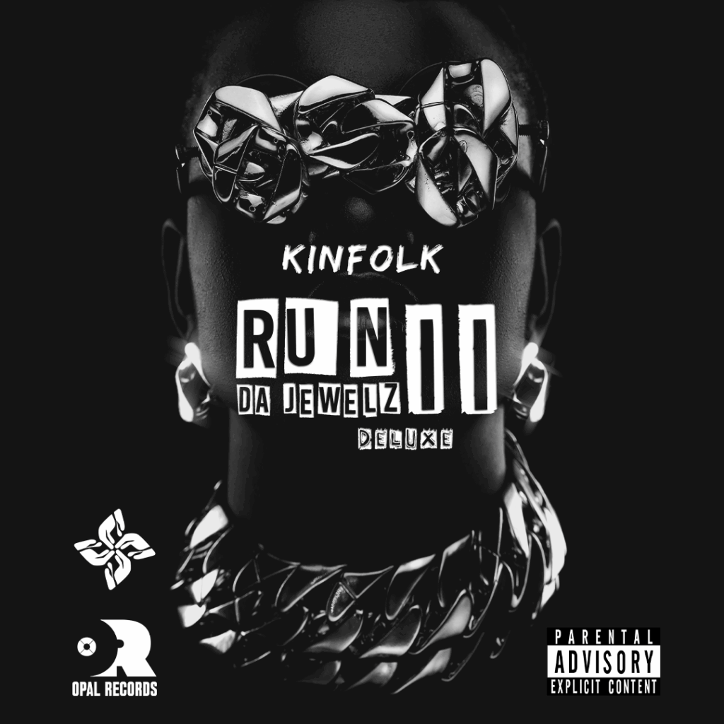
- 2 Album Covers
- A Social Media Mockup
- A Media Player
Key Visuals
This section showcases the finished visual elements developed for Opal Records, including logos, album and deluxe artwork, a social media mockup, and branded media player.

Opal Records Brand Mark
With a clean typographic approach, the initials “OR” are used boldly, featuring a vinyl record hidden in the negative space to represent the label’s foundational tie to sound and rhythm.
The design draws inspiration from the opal gemstone— known for its ability to refract multiple colours, symbolizing diversity, creativity, and the power of artistic expression.

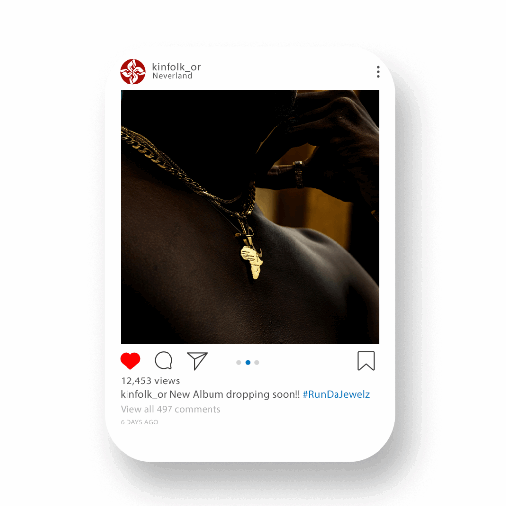
Social Media Mockup
This image was selected to reflect the core values and identity of Opal Records — a label rooted in Black culture, unity, and authenticity.
The deep, rich skin tone of the subject celebrates melanin and representation, while the gold Africa pendant symbolizes pride in heritage and global connection.
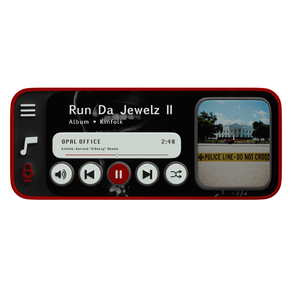
Media Player Mockup
The media player mockup for the track Opal Office features an image of the White House partially obstructed by a yellow police line — a deliberate choice to reflect themes of duality of representation.
Specifically questioning who holds the mic, who gets silenced, and how music can serve as both resistance and reclamation.