ui/ux Design Development
Letterboxd Mobile Re-Design
Summary
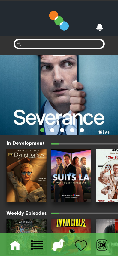
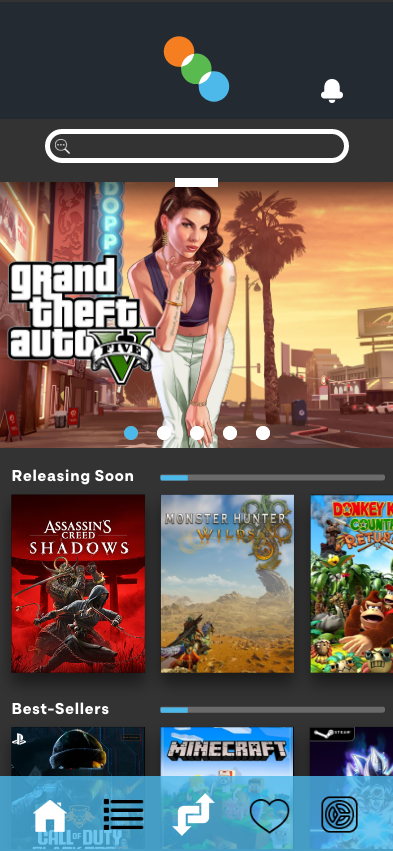
This redesign aims to transform Letterboxd from a niche film-tracking app into a comprehensive social hub for all forms of media. By expanding support for television and video games, refining the user experience, and strengthening the user interface, the goal is to create an app that feels intuitive, visually compelling, and deeply connected to the culture of media enthusiasts.
01
Objectives
The goal of this project is to improve the overall user experience and visual appeal of the mobile interface. Key objectives include enhancing usability, streamlining navigation, and ensuring consistency across design elements.
02
Project Plan
The project will be completed over four key phases: Discovery, Planning, Design, and Review. Each phase will focus on refining the mobile experience while allowing space for iteration and feedback to ensure the final outcome is intuitive and user-focused.
03
Phase One – Discovery
This phase focuses on gathering insights to better understand user needs, behaviours, and expectations. Through a combination of market research, competitor analysis, and user feedback, we aim to identify key challenges and opportunities that will guide the direction of the redesign.
04
Phase Two – Planning
In this phase, the insights from research are translated into a clear strategic direction. Key goals, user flows, and structural decisions are outlined to establish a strong foundation for the design.
05
Phase Three – Design
This stage focuses on bringing the project to life visually and functionally. Wireframes evolve into high-fidelity designs, with interactive elements and responsive layouts considered.
06
Phase Four – Review
In the final phase, insights from testing are applied to refine the design, leading to the development of the final prototype. Feedback is collected and adjustments are made as needed.
Objectives
The objectives for this project aim to improve key aspects of the user experience, focusing on enhancing design, functionality, and accessibility. The goal is to create a more intuitive and engaging experience for users while ensuring alignment with industry best practices.
01
Modernizing the mobile App Design
Revamp the mobile app’s user interface to reflect current design trends, improve usability, and ensure a seamless, intuitive experience for users.
02
Enhance Navigation for Better UX
Refine the app’s navigation structure to ensure a smooth and intuitive journey for both new and returning users, reducing friction and improving overall usability.
03
Boost User Engagement
Introduce advanced social functionalities and personalized content recommendations to foster deeper user interaction and long-term app engagement.
04
Enhance Accessibility for Inclusive DESIGN
Refine the app’s interface and functionality to ensure a seamless and inclusive experience for users of all abilities.
Project Plan
The project plan follows a structured approach, with distinct phases to guide the process from initial research through to final testing. This ensures that all aspects of the redesign are thoroughly considered and refined, with ample opportunities for feedback and improvement along the way.
PHASE 1
Discovery
- Conduct user interviews with active Letterboxd users to gather insights on current behaviours, pain points, and desired improvements.
- Review public app feedback to identify recurring user complaints, feature requests, and opportunities for improvement.
- Conduct a competitive analysis of similar platforms to uncover feature gaps and opportunities for differentiation.
- Develop a moodboard to establish visual direction and design inspiration.
PHASE 2
Planning
- Develop user personas to represent key audience segments and guide design decisions.
- Design low-fidelity wireframes to outline the app’s structure and layout, focusing on functionality and user flow.
- Design high-fidelity mockups to visualize the final user interface, incorporating branding, colours, and interactive elements for a realistic user experience.
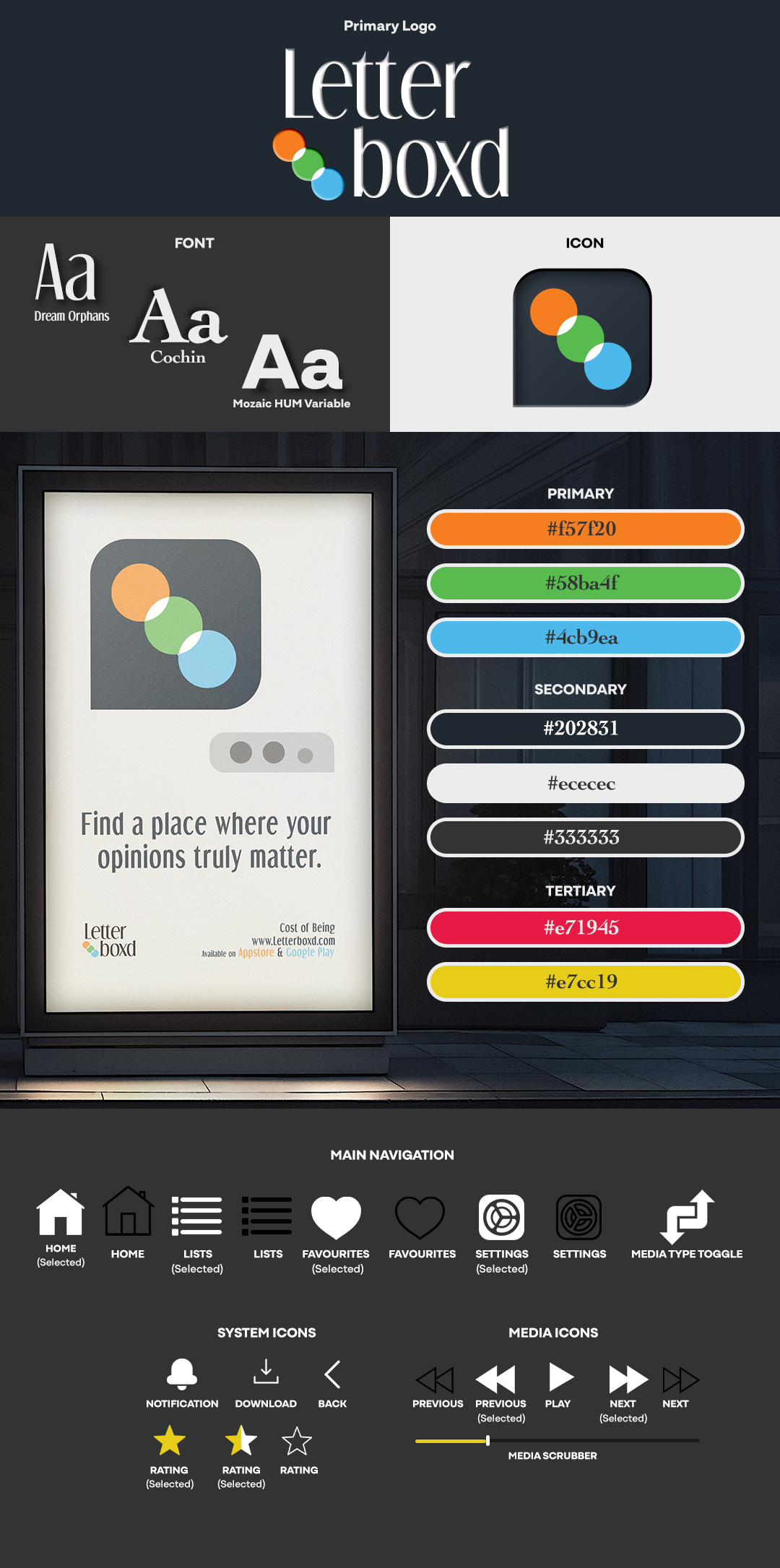
- Create a style tile to establish visual design elements, including typography, colour palette, UI components, and logo redesign.
PHASE 3
Design
- Enhance wireframes by developing high-fidelity mockups with refined design details and realistic UI elements.
- Develop several interactive prototypes to showcase different user flows and interactions.
- Conduct a User Acceptance Testing (UAT) session to gather feedback and ensure the design meets user expectations.
PHASE 4
Review
- Refine and adjust high-fidelity prototypes based on UAT feedback and findings.
- Finalize and polish the case study with my findings, ensuring clarity, consistency, and visual cohesion throughout.
PHASE 1
This phase focuses on gathering insights to better understand user needs, behaviours, and expectations. Through a combination of market research, competitor analysis, and user feedback, we aim to identify key challenges and opportunities that will guide the direction of the redesign.
User Interviews
Interviews were conducted using a custom questionnaire I designed in two versions to encourage diverse, authentic responses. Questions focused on General Use & Experience, Discovery & Logging Films, and Improvements & Accessibility.
Findings
- Users appreciate Letterboxd’s sleek design, ease of use, and visually engaging movie tracking features. However, many express a desire for improved efficiency—particularly advanced search options and better watchlist organization.
- Users enjoy Letterboxd’s intuitive discovery and logging tools, especially watchlists and tags. However, managing large watchlists can be challenging due to limited organization features. Users also want review drafts, better text formatting, and folder support.
- Users like Letterboxd’s core experience but see room for improvement in organization and accessibility. Feature requests include watchlist folders, collaborative lists, better filters, and more inclusive design features like contrast and screen reader support.
App Review Analysis
Following the user interviews, I created an analysis report based on five public sources that reviewed the Letterboxd platform within the past two years: PCMag, TechRadar, The Miami Student, Google Play Store, and Apple App Store.
Findings
Users consistently praise Letterboxd for its visually appealing interface and its seamless approach to tracking, reviewing, and discovering films. Features like the diary, watchlist, and curated lists are especially valued for making film exploration both fun and intuitive. However, recurring feedback highlights the need for better organization tools—particularly for managing large watchlists—and improved user discovery. While the platform is beloved by film enthusiasts, refining its usability could elevate the overall experience.
Competitor Analysis
To further support my research, I conducted a comparative analysis of similar applications, including IMDb, Trakt.tv, JustWatch, Metacritic, and Rotten Tomatoes. This helped identify common strengths, gaps, and potential opportunities for differentiation in Letterboxd’s feature set and user experience.
Findings
Competitive analysis of platforms like IMDb, Trakt.tv, JustWatch, Metacritic, and Rotten Tomatoes highlighted weaknesses in outdated interfaces, limited social features, and poor media discovery. Letterboxd can differentiate itself by improving discoverability, personalization, and community engagement.
Moodboard

PHASE 2
The project plan follows a structured approach, with distinct phases to guide the process from initial research through to final testing. This ensures that all aspects of the redesign are thoroughly considered and refined, with ample opportunities for feedback and improvement along the way.
User Persona 1
Angela Ross – Film Enthusiast

User Persona 2
Otto Magu – Video Game Legend

Lo-Fi Wireframes

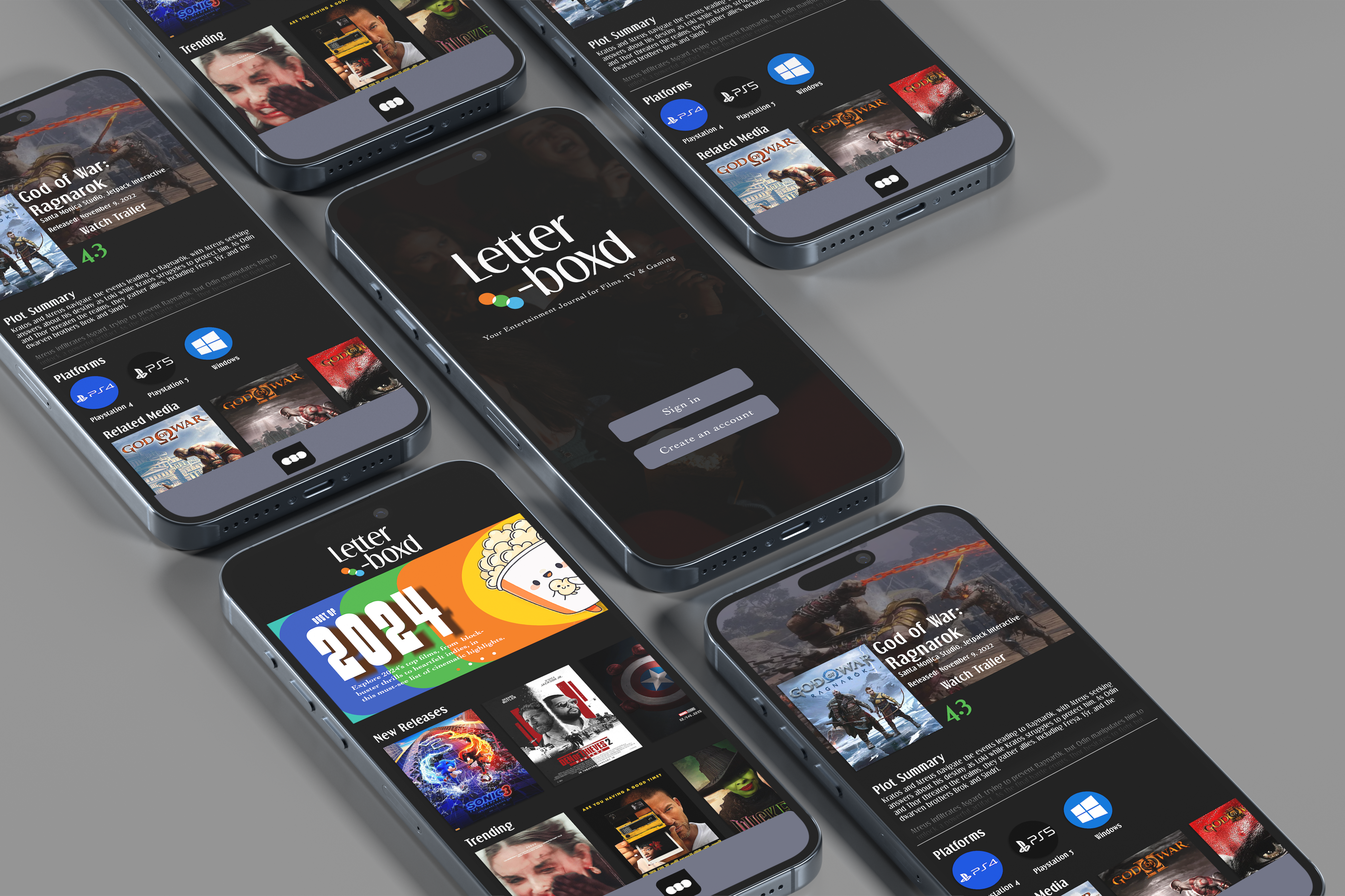
Hi-Fi Mockups
Style Tile

PHASE 3
In this phase, insights from earlier research were translated into design concepts, wireframes, and high-fidelity mockups. A user acceptance test (UAT) was also conducted to gather feedback and validate usability. The Login flow prototype can be found at the link below.
Findings
The UAT confirmed the prototype’s effectiveness in addressing user needs. While the overall flow and functionality were successful, feedback suggested refining font selections and making slight alignment adjustments to improve the visual polish. An important takeaway from the feedback received was the expectation to make this a full fledged app prototype seemed overwhelming and I should focus on specific interactions.


PHASE 4
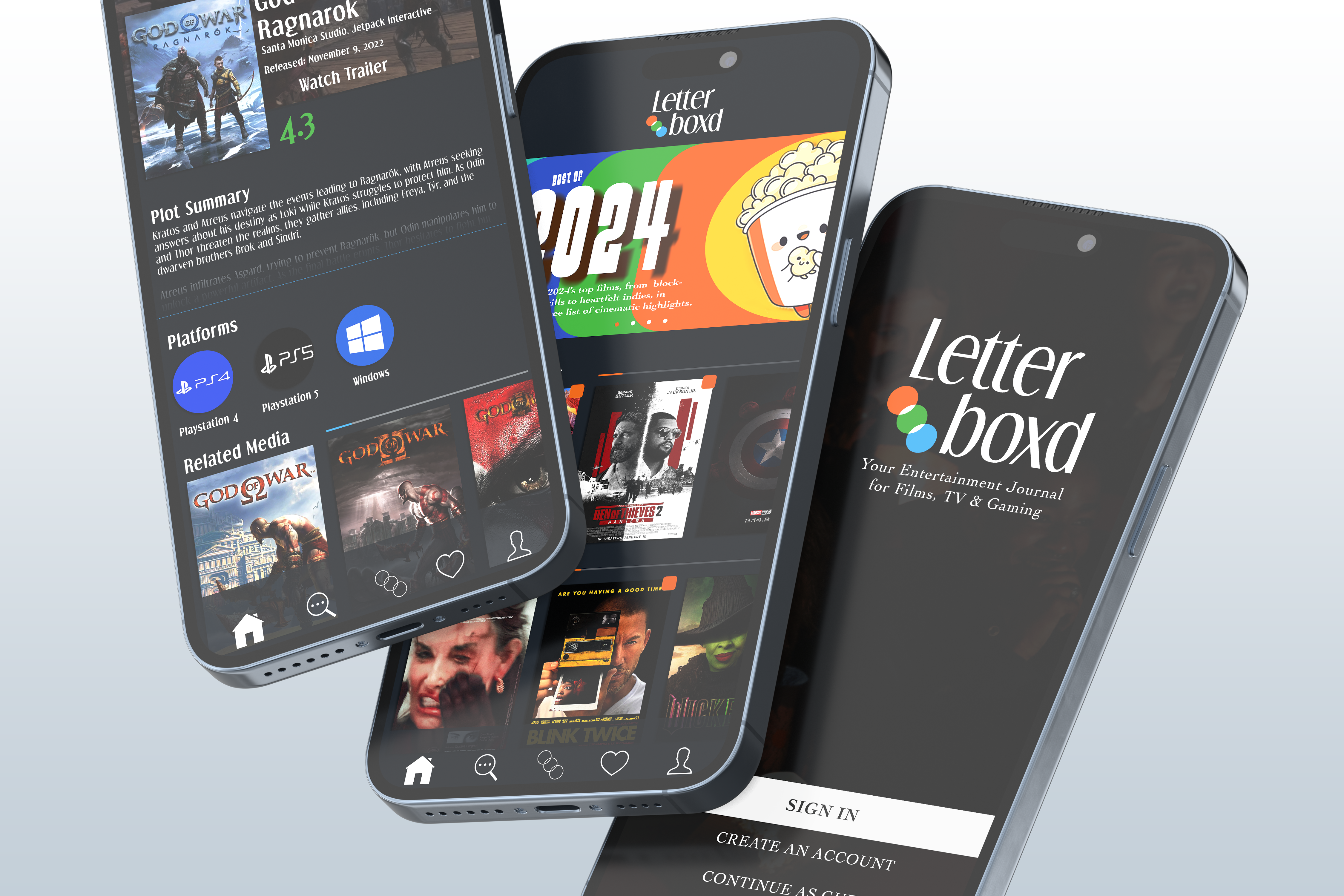
Following the most recent round of UAT, the necessary refinements were made to the prototype—most notably font adjustments and alignment fixes. The final version is now complete and ready to be explored. The media selected for further in-depth exploration are the following:
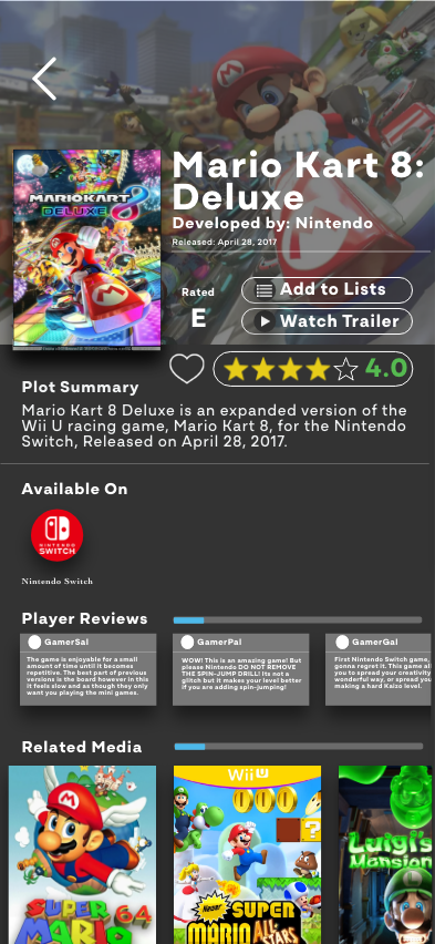
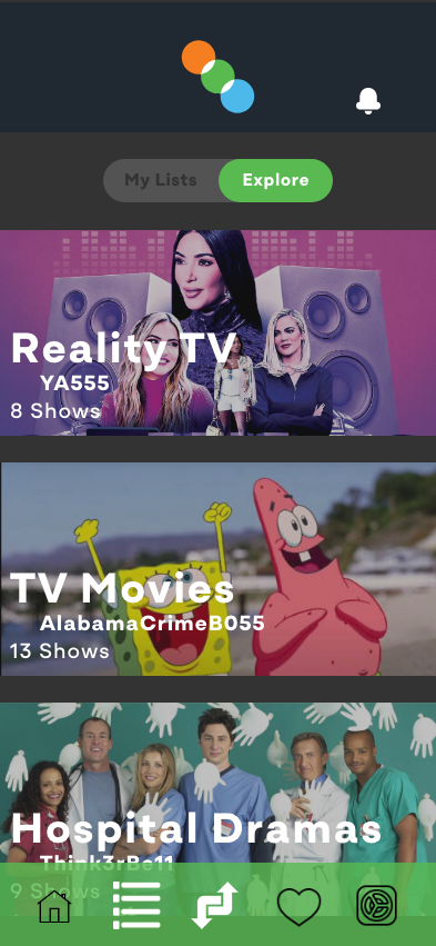
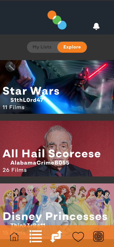
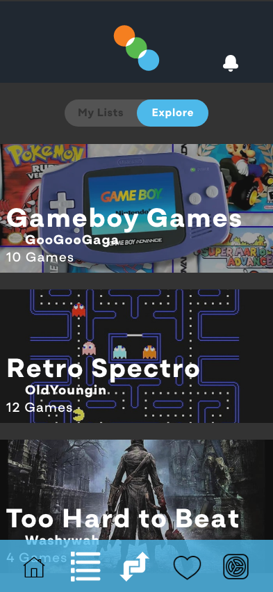
Mickey 17 (film), Shrexellence and Star Wars (film lists), Family Guy (television), COOL KILLERS and Reality TV (television lists), Mario Kart 8 Deluxe (video game), Tough Guys and Retro Spectro (video game lists).